Preconceptions - Lessons from a Dishwasher Machine
During the discovery phase for a new app, it is important to understand all preconceptions that users will have. There will be many actions and elements that are familiar to users, and they should be leveraged as much as possible. One simple example of this is icons. iOS users expect the share and back icons to look a certain way, and Android users expect these icons to look a certian but different way.
![]()
By using these familiar icons, users will be able to quickly identify what the button does without spending extra brain cycles determining what the button might do.
Beyond learned concepts from the digital world, we should consider other information that users will bring with them to a digital interface. For instance the colors of a traffic light. Most people assume green means proceed and red means stop. If an interface contradicts these assumptions, the interface quickly becomes troublesome to navigate.
An example that recently caused me to pause was the labeling of dishwashers at a co-working space. The text has been removed so we can focus on the colors.
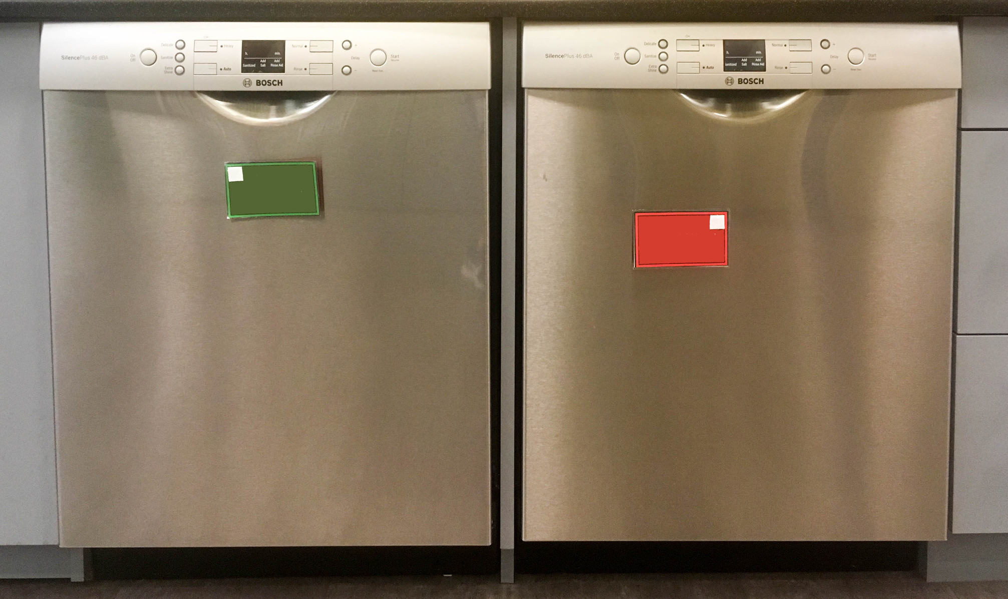
If you have a dirty dish, which dishwasher do you open and place your dish into? Does green mean the dishes are clean? Does green mean the dishes are dirty? Does green mean the dishwasher is running?
Does adding text change the way you think?
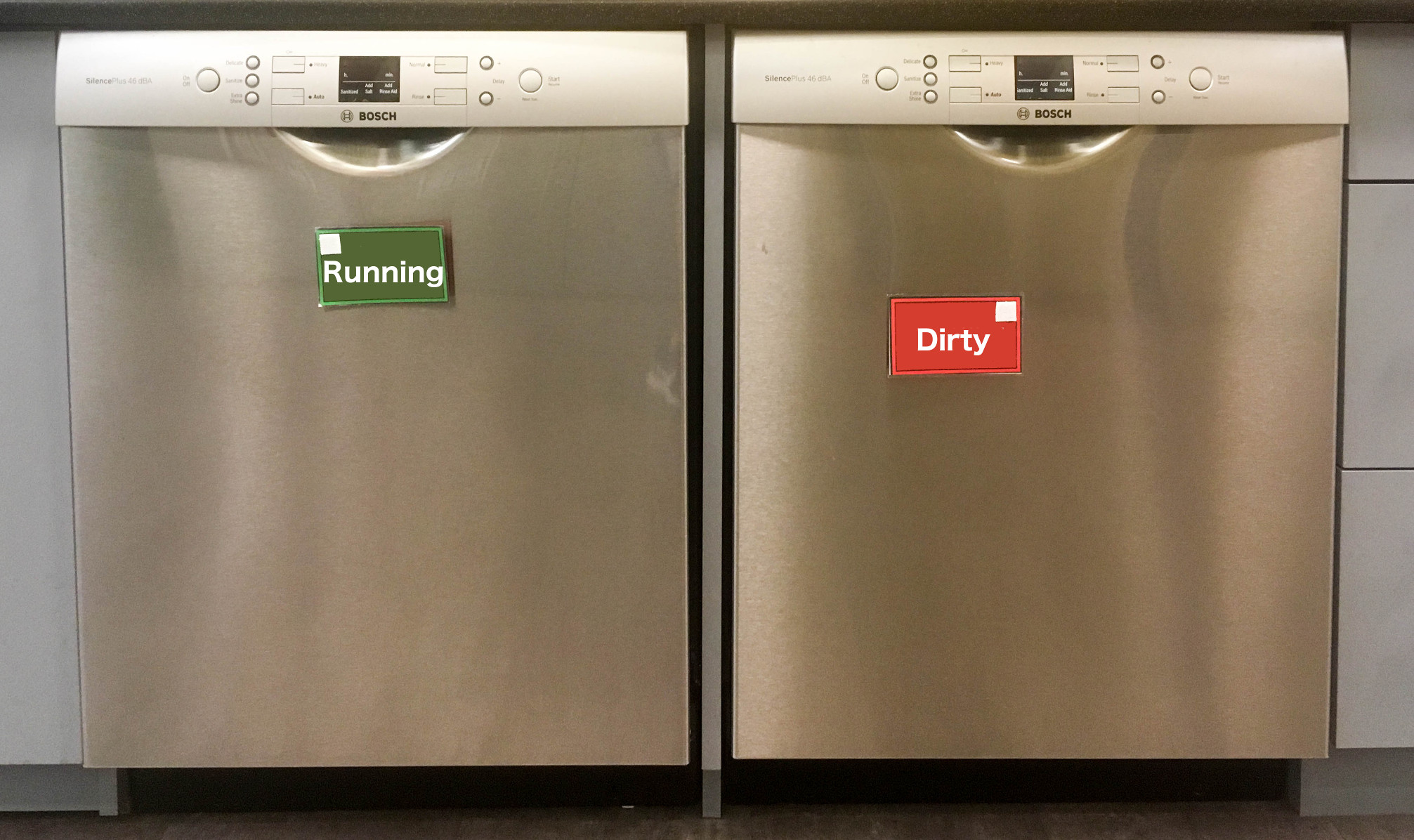
What if we swap the text?
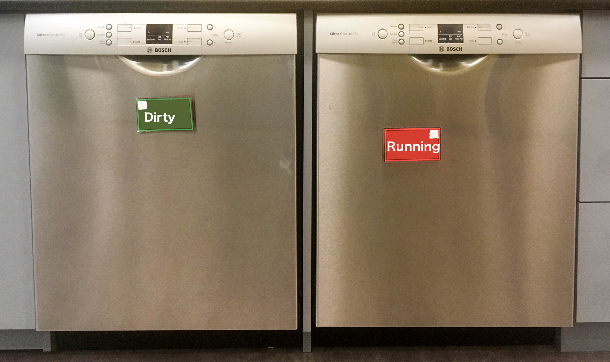
Is color enough to make it clear how to interact with the dishwashers? Is the text able to make you reverse the choice you originally made? Does the color add confusion instead of clarity?
My interpretation of the colors is explained by how I interact with my home dish washer. The lights remain off when it is not running. During operation, red lights elucidate status of the washer. I have learned that red lights means the dishwasher should not be opened. When the wash is complete, the lights turn off except for a single green light denoting the cycle has successfully completed. After having the same dishwasher for nearly five years, I have associated colors to states. A green light means clean, and a red light means dirty.
When I first encountered the signs on the dishwashers above, I had to pause for a moment because I understood green to mean a wash had just been completed, and I did not want to place a dirty dish into a clean dishwasher.
It is likely that different dishwashers have caused different associations for people, so is color enough to portray the intended action in the case of a dishwasher? Some research would be required to understand how the majority of people interpret the colors. If there is not a common shared conception of color, then perhaps a symbol could ease the learning curve, and color could be avoided altogether.
Interfaces should avoid situations that require extra thought in order to complete an action. With some attention to how users interact with other devices, and what preconceptions they might have, these issues can be avoided.
And for those of you that are wondering what the actual text read, here is the original photo. Green means put your dirty dishes in here, red means running, do not open.